Suite of iconography for Wayfair
Project Type: iconography, vector illustration, icon design
Project Details: The goal of this project was to create a cohesive set of icons that feel unique and ownable to the Wayfair brand, yet easily understandable and helpful to users. To achieve ownability, the icon design pulls in the core geometric shapes of the logo to inform its build. Each icon is built using a set of rules easily adoptable by different team members. Icons are used on site to aid the user experience and help them understand key services from the brand. Icons are also used across other marketing channels to enhance messaging and add visual interest.
Year: 2021
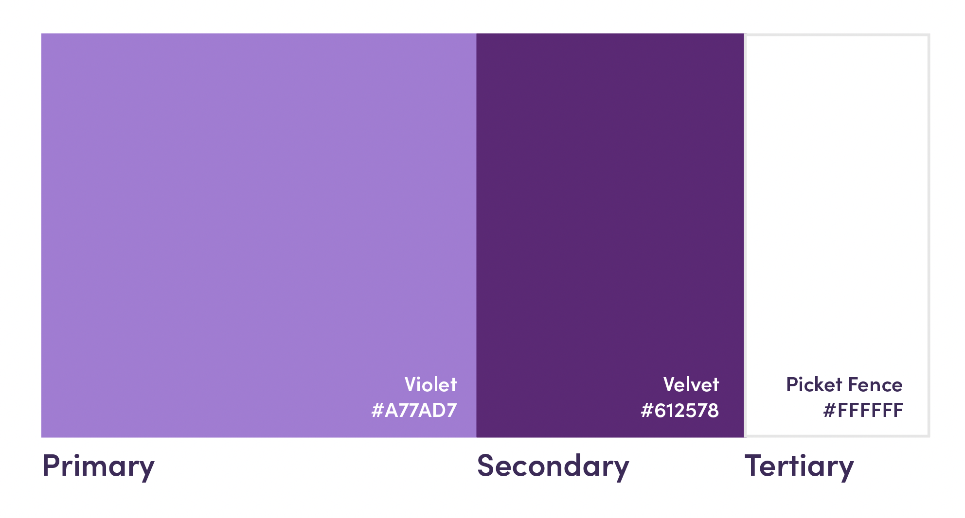
Colors were chosen from our secondary brand palette. This ensures that the icons on site and in marketing assets do not over power or compete with imagery or CTA buttons, but ensure they feel cohesive with other brand assets.
Icons on Wayfair homepage (click to enlarge)
Icons on Wayfair product page (click to enlarge)
Icons used on Instagram
Icons used in print
To ensure flexibility across assets, a line version of the icons were made as well.
All graphics are property of Wayfair®.


